
With the NFL now allowing for an array of uniform styles during the season, I'd like to take the chance to just pick what I would like every team to use as their primary uniforms. This is nothing more than just a dream post that needs no arguments. I'm not saying to not have alternative or throwback uniforms, but my picks are what I'd like as their normal unis. Just a preference. Let's go.
NFC EAST
Dallas Cowboys: Well, this is easy. Their long time uniforms don't need any changes. It is akin to the Yankees' pinstripes or the Canadiens sweaters.
New York Giants: The Giants have had their uniforms in place for a long time, with the only change being their helmets. I grew up with the entire GIANTS name on the helmet, which I really like. But I think the NY logo should be the one that stays.
Philadelphia Eagles: The Eagles kelly green uniforms really pop. Like the Giants, that's the era of Eagles I grew up with. But also like the Giants, I think their current look is the one to go for. They've had this look for a long, long time and they've won two Super Bowls with it. The kelly greens are an outstanding alternative.
Washington Commanders: This one is a bit complicated because of the name change a few years ago. Having said that, merging the old uniforms with the new logo/name seems to be the popular look. It looks better than the ones they designed, and since I'm not using this exercise to create new unis, the helmet is the way to go.
NFC SOUTH
Atlanta Falcons: There are a lot of options. There are the red jerseys and helmets of the 80s, the all-black of the 1990s and a lot of combinations in between. But I'm going to land on the ones Julio Jones is wearing here. It has the nice mix of both the red and black.
Carolina Panthers: The Panthers have had pretty much the same look for their entire existence, with the exception of a tweak to their logo some years back. That look is great and should never be changed.
New Orleans Saints: The Saints uniforms ... for the most part ... have been the same for a long, long time. Let's stick to what works.
Tampa Bay Buccaneers: I know people really love the orange creamcicle uniforms, but I only like them as a throwback. Those uniforms are from a time where the Bucs were a laughingstock organization and doesn't represent the success they've had with the pewter look. Now, there have been adjustments to the pewter helmets and uniforms (ugh, those clock radio number fonts). I like the early 2000s look where the flag on the helmet wasn't as large and the pants were pewter.
NFC NORTH
Chicago Bears: The Bears classic look stays.
Detroit Lions: While there have been slight changes to the uniforms, the Honolulu blue and the meaness of the logo, the style has been pretty consistent. I like the uniforms they had before the more recent change. Let's land there.
Green Bay Packers: This is easy. Next.
Minnesota Vikings: The Vikings are one of the teams that had a certain look, then ruined it by tampering too much, only to modernize the basic look. Their current look is very appropriate.
NFC WEST
Arizona Cardinals: The Cardinals are at their best with the classic look. I do like the meaner cardinal on the helmet, but their uniform choices are really clean. The all-white look is awesome. I'm not a fan of the color rush look, but the Cardinals' all-reds are doable. For this exercise, I'm picking the red jerseys with the white pants, but I can go with all white or all red as well. It gives the classic look for one of the oldest franchises in the NFL while looking modern for a team in a sleek dome in the desert.
Los Angeles Rams: The Rams have had wild changes over time. The era I grew up with was the blue helmets with the simple yellow rams horns with yellow pants. The blue jerseys also had the yellow horns on the shoulders. When they moved to St Louis, the yellow turned to a dark gold look. That color should only live in Missouri. Once upon a time, the rams horns were white and they brought that back to LA for a bit. The current look is a modernization of that mixed with off white jerseys. I'm going to live in the now ... as much as I want that Eric Dickerson look ... I'll go with what they look like now. Not so much the off-white but the modernization of the classic look works well with their indoor digs in LA.
San Francisco 49ers: The 49ers look has actually had quite a bit of changes over the last four decades. I like that the Niners have gone back to modernize the era most people connect them with. Updating the Joe Montana look is the way to go. I like the gold pants instead of the white uniforms. I don't like the black additions to the logo or helmets, so keeping it old school is the way to go.
Seattle Seahawks: The Seahawks current look is great and lends itself to a lot of opportunities for alternates. Their throwbacks are nice as well. But their current look is fantastic.
AFC EAST
Buffalo Bills: Yeah, I want the 1990s Bills look back. The red helmets with the white masks. The blue jerseys. Give me that over the white helmets.
Miami Dolphins: This one is tough. I do like the modern version of the Dolphins uniforms. The bright jerseys with the sleek dolphin. I am a fan. But when I see those throwback uniforms out there, I just really like them. The old school dolphin with the M helmet is great while the orange accents really look cool.
New England Patriots: Many think the Patriots uniforms come down the Pat the Patriot versus Elvis the Patriot. Helmet wise ... yeah. But the Elvis helmet had those busy uniforms in the 90s and even the Tom Brady era uniforms had some changes. But the main one people think of should be the ones we go with. I do like the updated look of the uniforms now ... but let's go back to greatness.
New York Jets: I don't think any Jets uniforms are very good. I'll start off by saying I didn't like the white helmet look they had in the 1960s and then brought back in the 2000s. I kinda think the uniforms they are doing now are okay enough. Just don't gloss up the helmets.
AFC SOUTH
Houston Texans: I would really like the Texans to be able to get back the Oilers branding and change either to the Oilers ... or keep the Texans name and just use the Oilers look (it works). But I'm not doing hypotheticals here, so lets' keep the Texans uniforms the same.
Indianapolis Colts: Keep it simple.
Jacksonville Jaguars: The Jaguars have been all over the place with their uniforms. Their original look got axed before they even got started. The weird color change helmets were a miss. Their current ones aren't bad at all ... but when they wear those throwbacks from the Mark Brunell era ... it looks classy. It looks great. I looks like the winner to me.
Tennessee Titans: Obviously the Titans are tied with the Oilers, but I really feel they should give that history back to Houston. That's for another discussion, but having said that I am taking the Oilers option off the table. The Titans uniforms break down to the white helmet era to the current blue helmet look. Give me the McNair look.
AFC NORTH
Baltimore Ravens: The look the Ravens have used for a long time is just fine.
Cincinnati Bengals: A long time ago, I told a friend of mine that the Bengals need to go back to those 1980s uniforms with a bit of modern sprucing. That was when they were wearing those candy corn uniforms. Magically, they did exactly that when the Joe Burrow era hit. So that's where I'm going with the uniforms. Sometime the right look was there all the time.
Cleveland Browns: The Browns should take note. They've done several changed to their uniforms and they all, frankly, suck. The Browns have a classic look that works just fine and shouldn't deviate from it. No big "Cleveland Browns" workmark or weird bars on the unis.
Pittsburgh Steelers: The classic look you know continues to work.
AFC WEST
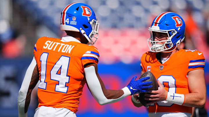
Denver Broncos: I usually like to stick with your championship look. But with the Broncos, I absolutely love the orange crush jerseys with the blue helmet and the D logo on them. It's so great.
Kansas City Chiefs: Chiefs have known they've got it right.
Las Vegas Raiders: The Raiders have a uniform that should never, ever be changed.
Los Angeles Chargers: Like the Buccaneers orange unis, I am against the grain on the Chargers powder blue uniforms. I enjoy them as a throwback than their primary jersey. Sure, I am absolutely fine with the look and it goes well with SoFi Stadium. But I really liked the navy blue helmets and uniforms of the 1990s. The Chargers have that integrated in a modern look, but I kinda like it the old school way with just a little updated look.
No comments:
Post a Comment